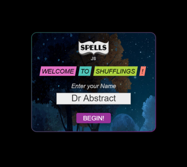
Spells at https://spellsjs.com
Has soft-launched. We have plans for it in the future, for now... we are testing the Shuffler - and have included 4 examples. Will roll out more.
Spells at https://spellsjs.com
Has soft-launched. We have plans for it in the future, for now... we are testing the Shuffler - and have included 4 examples. Will roll out more.
waauw cool .. nice logo and cool the cat at right bottom
only when hitting the box, it is dutch voice talking English at my computer,
so can you make it possible to set the language to 'ENG' are be able to set it like you did in https://zimjs.com/speech
When I set English it did not work on my iPad - so just change your voice to English if you want. We were going to try and provide different voices, languages, translations, etc. but it is just not properly supported - so we gave the text as text and that can be put into translators if desired.
super idea
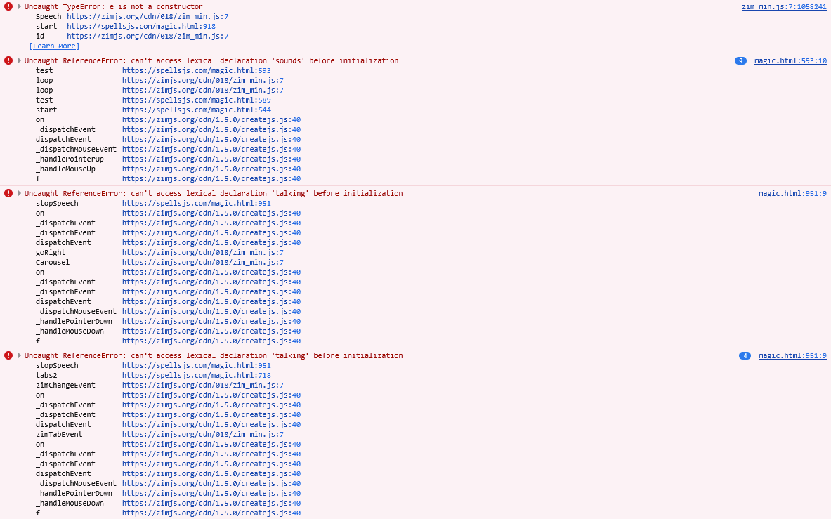
Is anyone having problems seeing https://spellsjs.com ? @karelrosseel82 is - we sent a note of the errors to our server fellow - he does not know why but we are keeping an eye on it. If you see this, let us know. Cheers.
Adjusted SPELLS in subtle ways. https://spellsjs.com It is still a placeholder feel and needs more explanation, about, etc. but the Shufflings concept is starting to make sense. We adjusted the data to handle live updates and different themes. So MAGIC is the first. There will be more like full games - like a Falling Catching game - might try that next to make sure the system works.
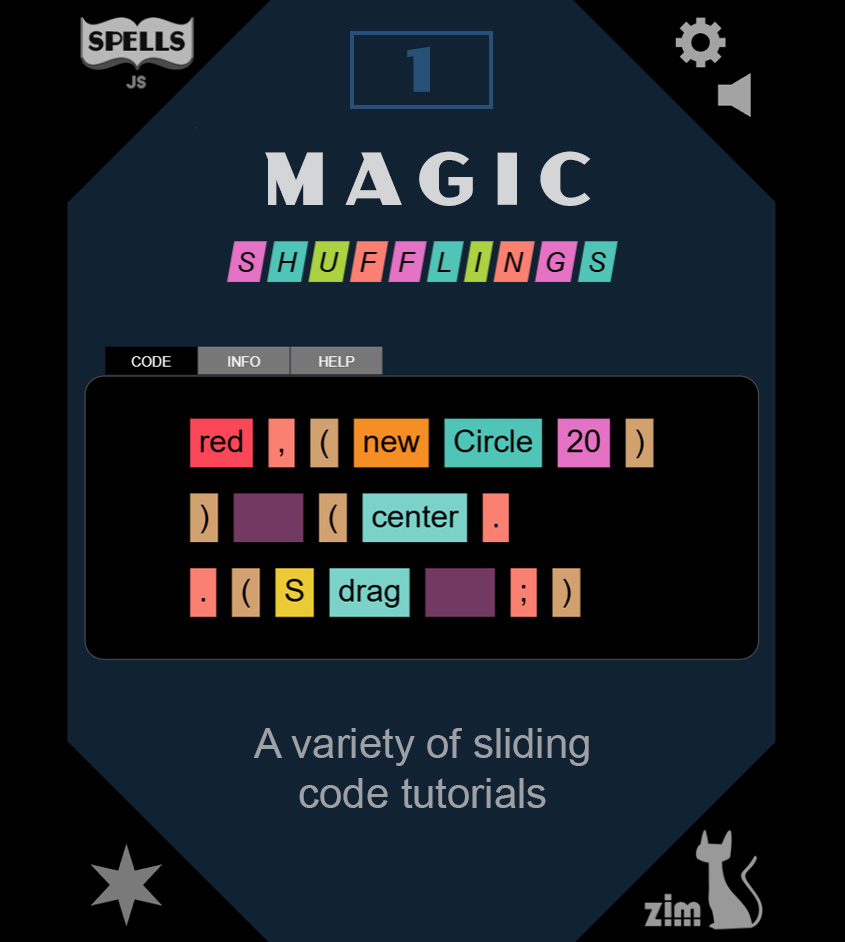
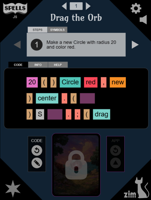
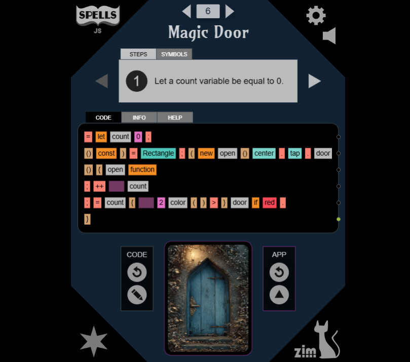
We are in creation phase, and it would be handy to have any feedback from the e-learning app creators on the Shufflings at https://spellsjs.com/magic.html for instance.
I tested! works perfect
only after finishing your are not automatic going to the next number into the stepper..
maby als a golden color of the finished code .. as in games you can only go tobthext level if you finished vfirst level..
her now you can go to whatever level/number into the stepper..
what do you think?
It's great. Very polished and extremely intuitive to use. Great from a learning point of view; it really gets you familiar with the commands and syntax.
Will give it some thought - I think exploring is okay. We are planning a couple more easy ones to insert near the start - bring the number to ten. Then work on other themes.
Thanks for sharing Spells, it looks a great concept!
I did get stuck quite early and needed my son to help figure out how to proceed haha.
I could never get the info and help tabs to actually show anything. On the second puzzle the code pane was blank so couldn't see how it was actually a tutorial.
Sounds like some technical difficulties then. What device were you on? If it was a computer, was there an error in the console F12? We will keep an eye out... almost seems like the data did not load fully for you. If you get a chance to try again or on a different device, let us know how it goes. I just tested a classroom and all was good. They were on different laptops and desktops. One could not press the GO button from the main spells page until the carousel was scrolled and then they could. So... not sure what that was about - Chrome on PC laptop.
Wow, it looks great Dan. I love how scaffolded it is. The commands you need only. The reward for each line as it is correct. Great stuff. I agree with Iestyn, it really gets you familiar with the code. I probably missed it but is there a way to see what you're doing wrong when you get stuck? Awesome stuff.
Chrome works much better, definitely a few issues to resolve with Firefox!
Okay - will check out FF - which we had not. Cheers.
EDIT - just tried FF on a desktop and it worked as expected. I did see a warning about the sound - that is built into CreateJS as it tests for what sounds it can load and a warning. But will see if we can recreate the other issue... etc. but tonight we party!
The app looks really nice, and it teaches correct writing in a fun and interesting way.
I can totally imagine kids sitting and playing with it.
That said, after they manage to write the code, I’d expect what they wrote to actually happen — right now it feels like the link between the code and the result is missing.
Also, the big drawing in the middle at the bottom feels a bit too heavy, and I’m not sure how it connects to the app. Same with the refresh buttons for the app or the code — they’re not very clear.
From a UX point of view, I’d make it even simpler: just one clear task for the users, without extra distractions.
Which icon is more of a reset for you?


I see we used both - and probably should just use one. For now, we changed all to the first one.
PREVIEW:
The preview at the bottom center shows a further-developed demo of the code. We did wonder if we needed an actual version of the code, but definitely wanted to show a fancy version to capture their interest and imagination. "Oh... I see, if we code, we can make cool things like this."
We were worried that if we did both the actual and fancy that we would over complicate, and we have not built an editor where whatever they type can be tested, so not showing the results of actual code was our solution. For that, the ZIM Kids tutorials with Slate, etc. can be used.
There is no real reason to make the main puzzle part any bigger. It ends up usually being limited by the width. So we have that space available, and I think making the demo any smaller, makes it hard to see and interact with.
EDIT - gave it some more thought and we will make a version with just the single task and no preview. We will test to see if we and others like that better. Stay tuned.